

There are so many different units in CSS, Most developers know how to work with pixels and percentage.There are other units that we use without understanding them well, and I was one of them. These units are rem, em. In CSS the units are divided into 3 types: Absolute, Relative, and Viewport. Each type contains a number of units, but here we are talking about px, percent, rem, and em.
We'll start with the pixel and percentages because they are the easiest thing to understand and most people use them a lot.
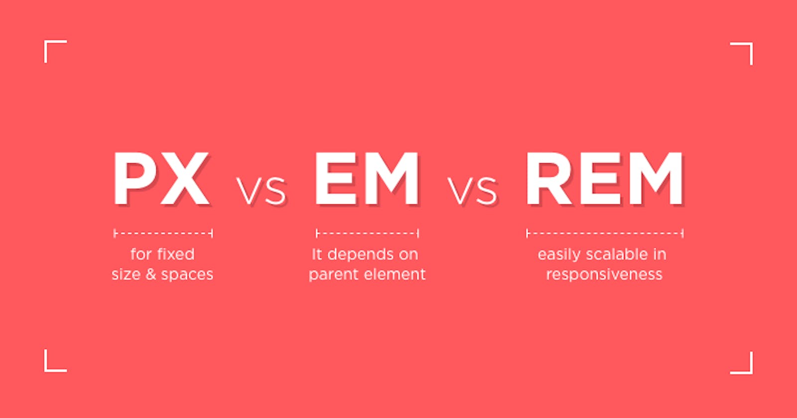
px: It is considered the easiest unit that we can use because it is very straightforward. I mean, if you say I will make a div and its guide is 500px for width, it will be 500px from the page size and it will not change with changing the screen size. Another example, is if the user changes the font size of the browser, there will be no effect on the font size in your application, and this is because we set the font-size: 14px as an example, CSS will not respect the font size that I change in the browser. But there are some cases we needed to use pixels, it remains good in it, for example, if I want to give width and height is fixed at this time, the pixel is a good well and with the border as well. But it is better that we avoid using the pixel too much in our application because it is not a good user experience.
percentages: a percentage considered the same as the pixel because they are very straightforward. percentages always see the direct parent and based on that you can handle the size of the element in this example.
We have 2 divs. The parent div's width is 60% of the size of the original page and the child div's width is 50%. For the parent div, it takes 30% of the original page size.
<div class = 'parent'>
    First div
    <div class = "child">Second div</div>
</div>

parent. {
    width: 60%;
}
.parent .child {
    width: 50%;
}
The percentages are good for responsiveness because by default it can resize the width of the browser, as opposed to the pixel, which is not good for responsiveness because it is fixed.
em: always or most of the time it is used with the font-size and with rem. The two are similar in some characteristics and different in some. em always depends on the parent element. For example, if I had a div of font-size: 16px, the child element would be 1em = 16px. But if the font-size is not explicitly defined, then the child will inherit until it reaches the root element, and the default value of the font-size is available through the browser and is usually 16px.
Here is an example for em.
<div id="parent" class="parent">
  Parent
    <div class="child">
       child
    </div>
</div>
Here if I have 2 divs the parent and child div are here and we give the parent font-size: 20px and for the child font-size: 1.2em so that I can calculate the value of 1.2em we use the value of the parent because the child depends on it so that is 1.2 * 20 = 24px. The em is always dependent on its parent. But if we use the em, we must take care, because if we have a nesting element. Imagine if we had more than one div inside each other and each one of them depended on its parent and took the font-size from it, so you would have a large number of font-size inheritance. This is why em is considered bad practice if we use it with the font-size.
rem: values are relative to the root HTML element, not to the parent element. I mean, if I have the root element of 16px, then 1rem = 16px. If the font is not specified in the root element, then 1rem will equal the default value provided by the browser(usually 16px).
But if we put the value of the root element in pixel, we will have the same problem that we mentioned above in the pixel section.
A solution for this problem is a percentage. Usually, default font size of the browser is 16px. we can put the font-size:100% will make 1rem = 16px.
Conclusion
ems and rems solved problems that were found in using the pixel. Recently, I'm using rem to font size and spacing and I use em for layouts but a little bit. if you want to talk to me about anything need to know or you found something that needed to be modified send me on Twitter.